← Back
Cataloging the World's Climbing Information
My Role
Sole designer working with the small team that runs theCrag (2018)
Skills Used
Research, User Stories, Information Architecture, Interaction Design, Mobile Design, Visual Design, Information Design, Data Visualization
Summary
theCrag is a popular website documenting nearly a million climbing routes covering the globe. I designed an iOS app to make this content more accessible to climbers while at the cliff. I incorporated design decisions into the website resulting in improved site structure, navigation, usability, and aesthetics.
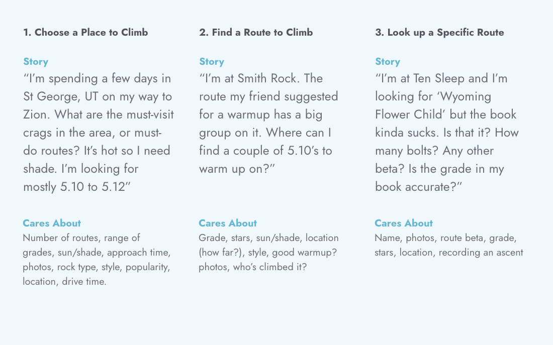
User Stories
The first step of this project was to narrow down the scope and define which stories would be most important for climbers on their phones. Three stories made the cut.
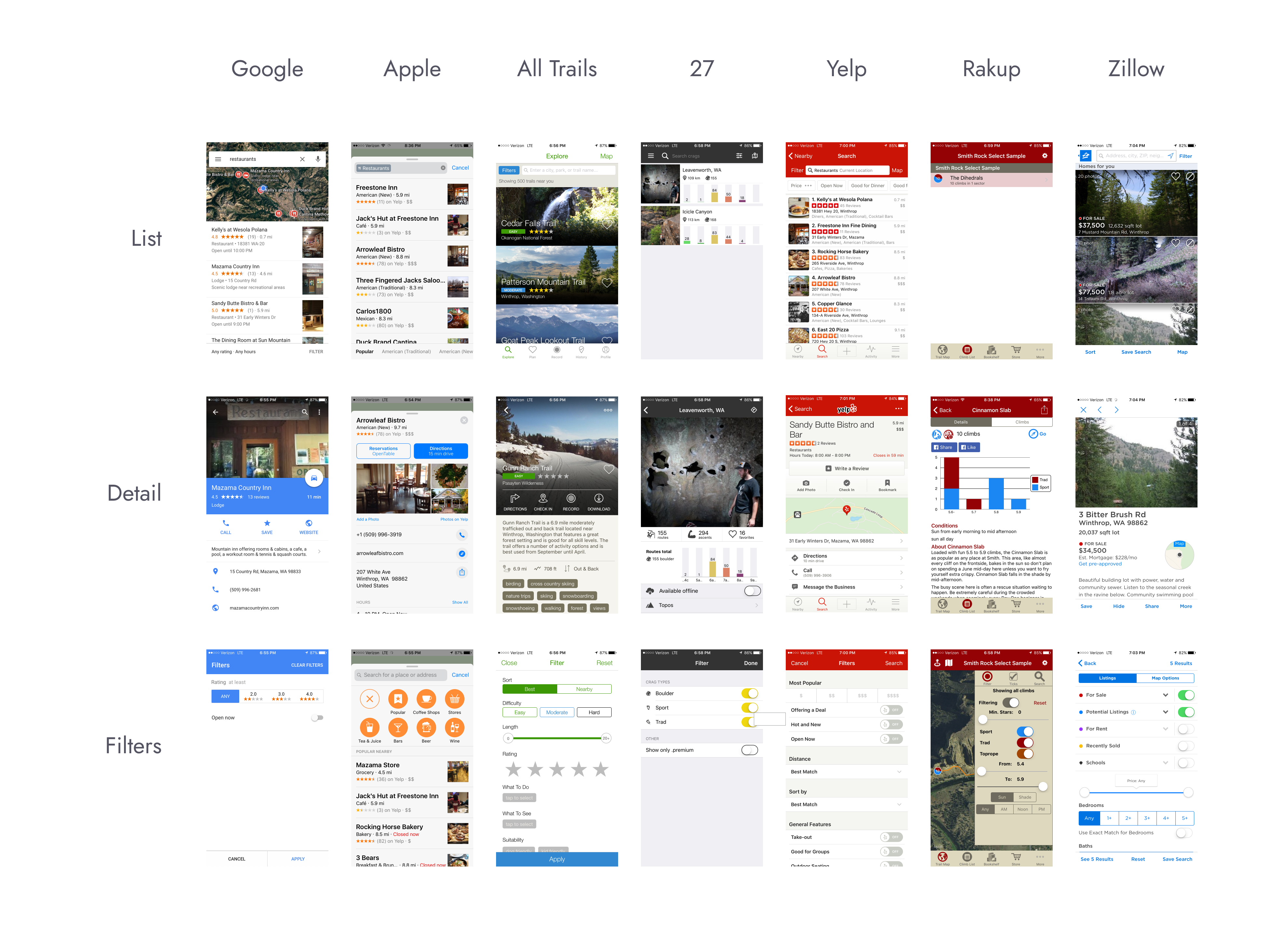
Competitive Analysis
All three stories use a location for context, so my next step is to collect examples of mobile apps that use the common location-based mapping paradigm.
Map states from a variety of apps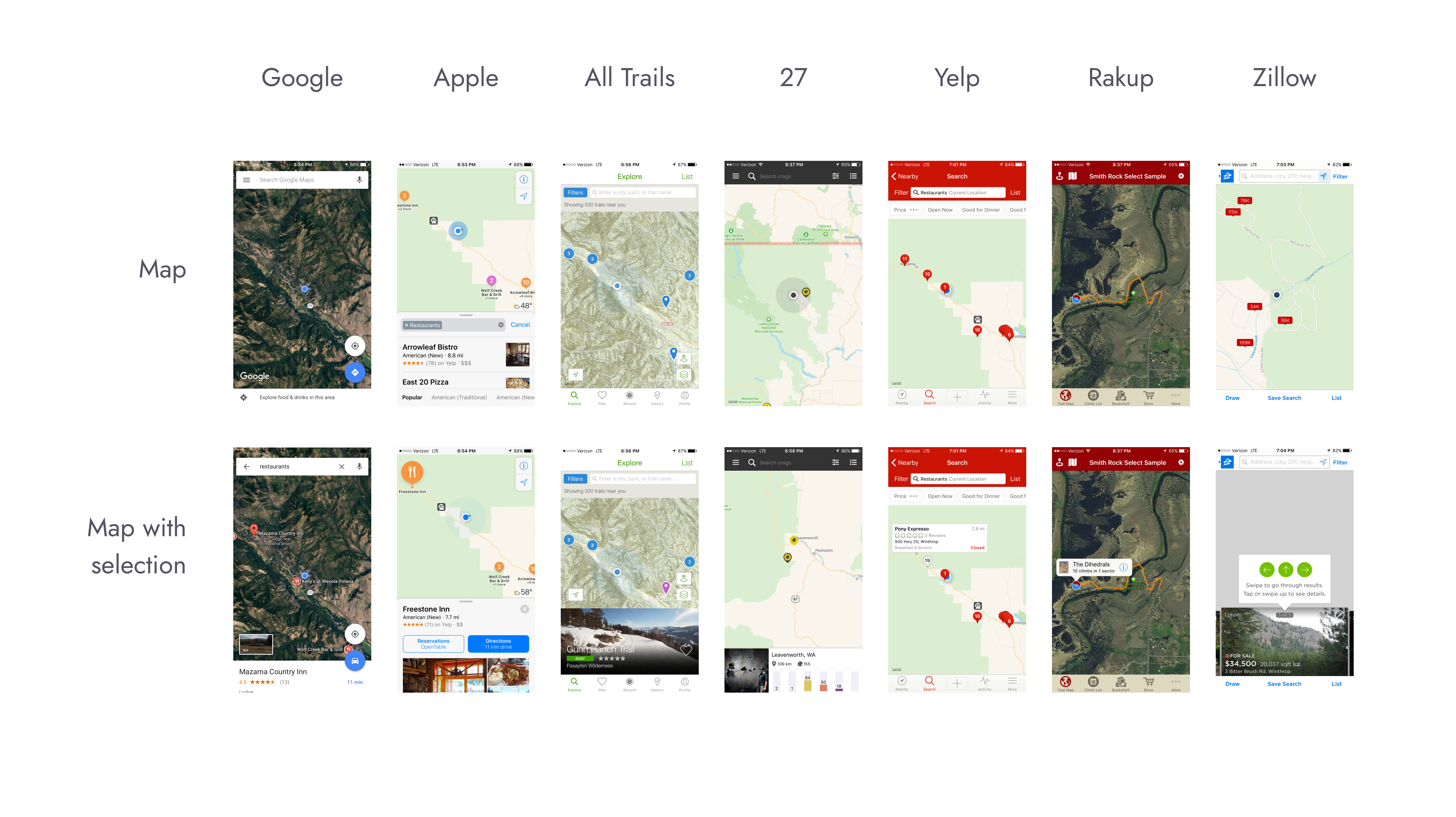 Search and filter examples from those apps
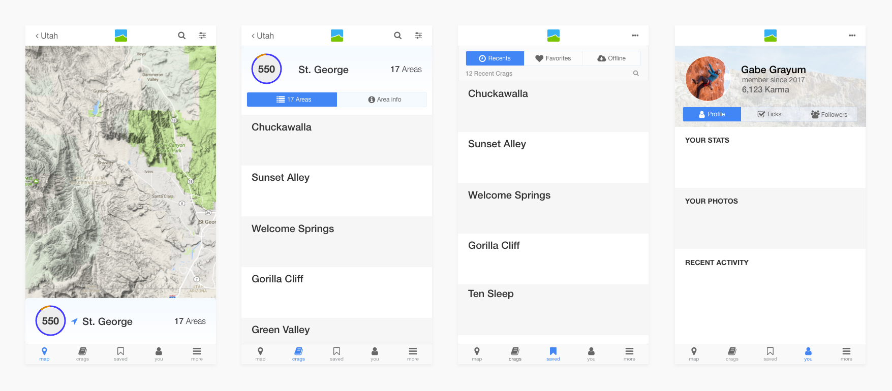
Navigation & Information Architecture
The next step is to determine the top-level structure of the app. Based on the user’s needs and similar apps I came up with four primary tabs.
- Search or browse crags on a map
- Search or browse crags in a list
- View recent or favorite crags
- View personal data and ticked routes
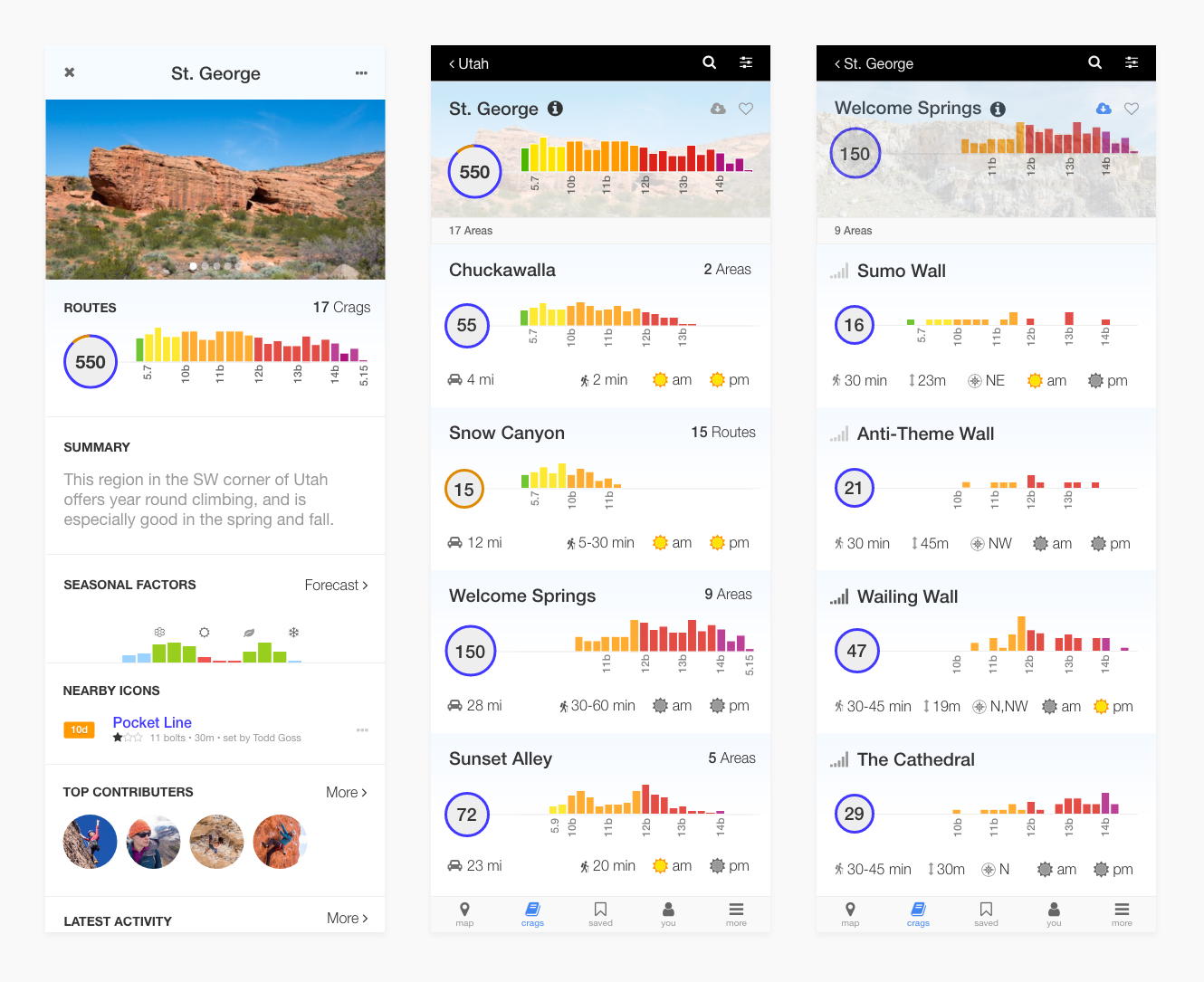
Information Design
Route Grades
Route grades are at the core of every climbing experience. The existing design lacked detail and wasn’t very useful. My design shows the distribution of grades for a given crag at a glance.
I updated the website layout to use my new grade design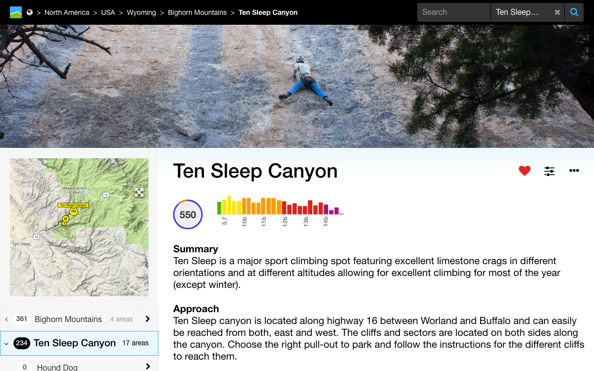
Crag Summaries
The first user story requires the ability to pick suitable crags from a list. The three most important questions a climber needs to answer to determine if a crag meets their requirements are:
- How many routes are there that I could climb? (grade, type)
- How long will it take to get there? (driving + walking)
- Is it appropriate for the season/weather? (sunny/shady)
Interaction Design
Route Lists & Topos
User stories two and three revolve around finding routes. A climber needs to match up a route name and grade with the physical location on the cliff. This is typically done using a combination of photos, and counting routes from an obvious landmark.
Climbers spend a lot of time standing in front of the cliff trying to identify routes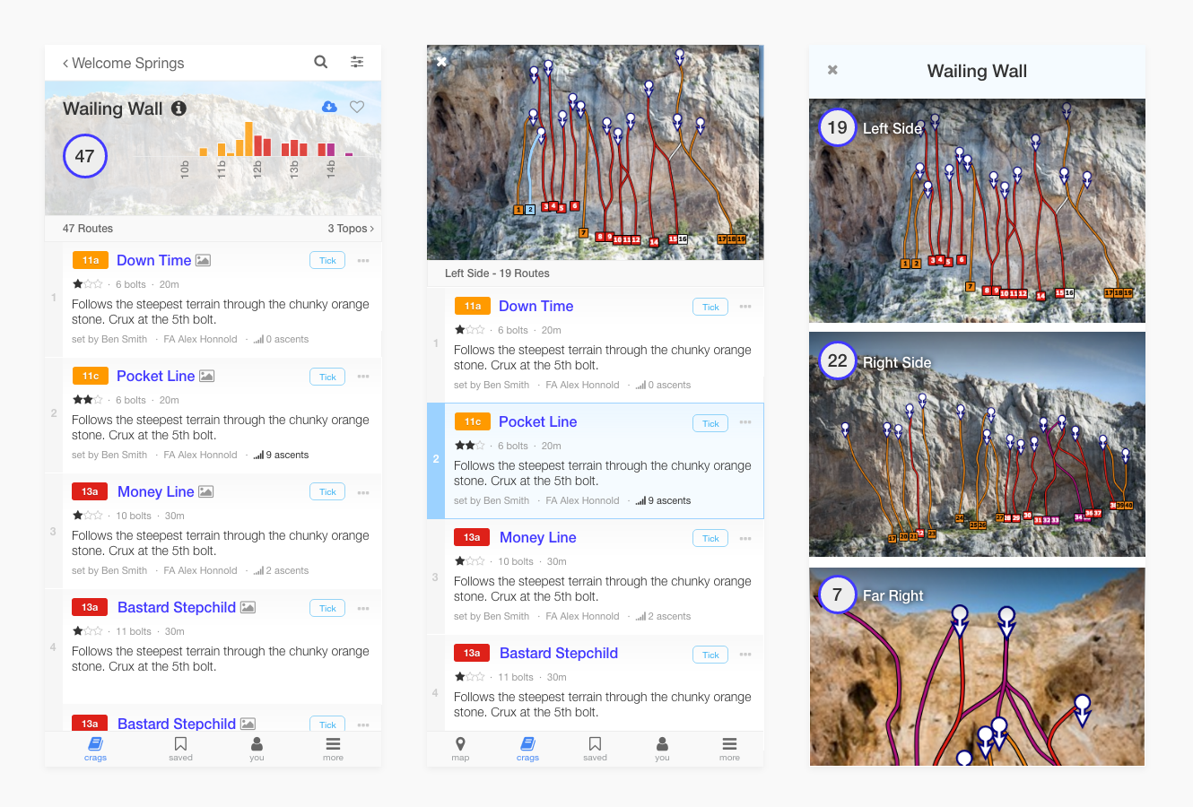
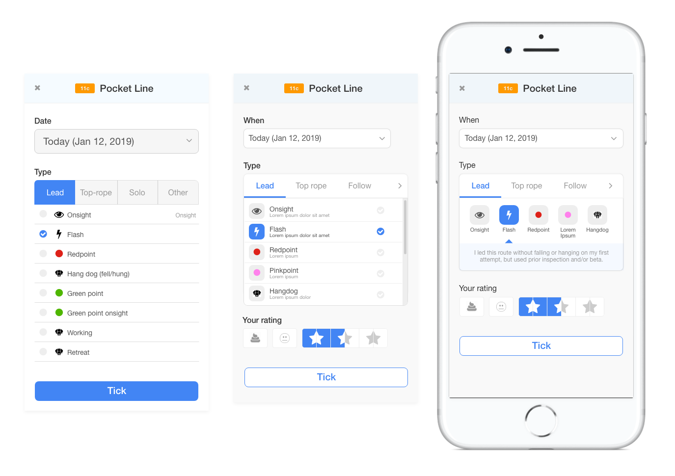
Ticking Routes
Climbers love checking boxes, but how a route is climbed is incredibly important. Sometimes, a simple wireframe can be misleading because it’s easy to gloss over the details. Designing this interface to handle the actual data proved to be a significant challenge.
The wireframe precipitated a lively discussion about the data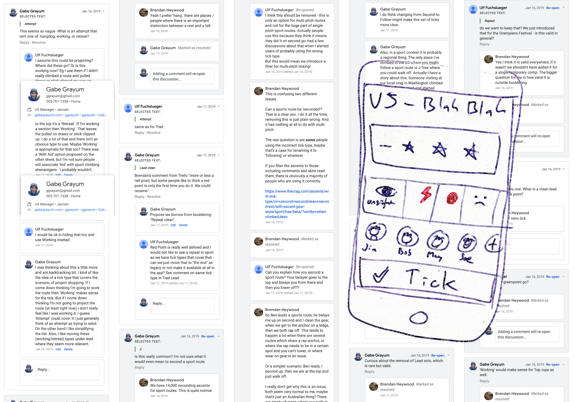
- I needed to support around 30 ascent types
- Present the common ones by default and hide the obscure ones
- Accommodate newer climbers who don’t know the jargon
- Fit everything on one mobile screen
Outcome
A dev ready prototype of the iOS app, and a refreshed website design with vastly improved navigation, information hierarchy, and visual design.
The shiny new website design and companion mobile app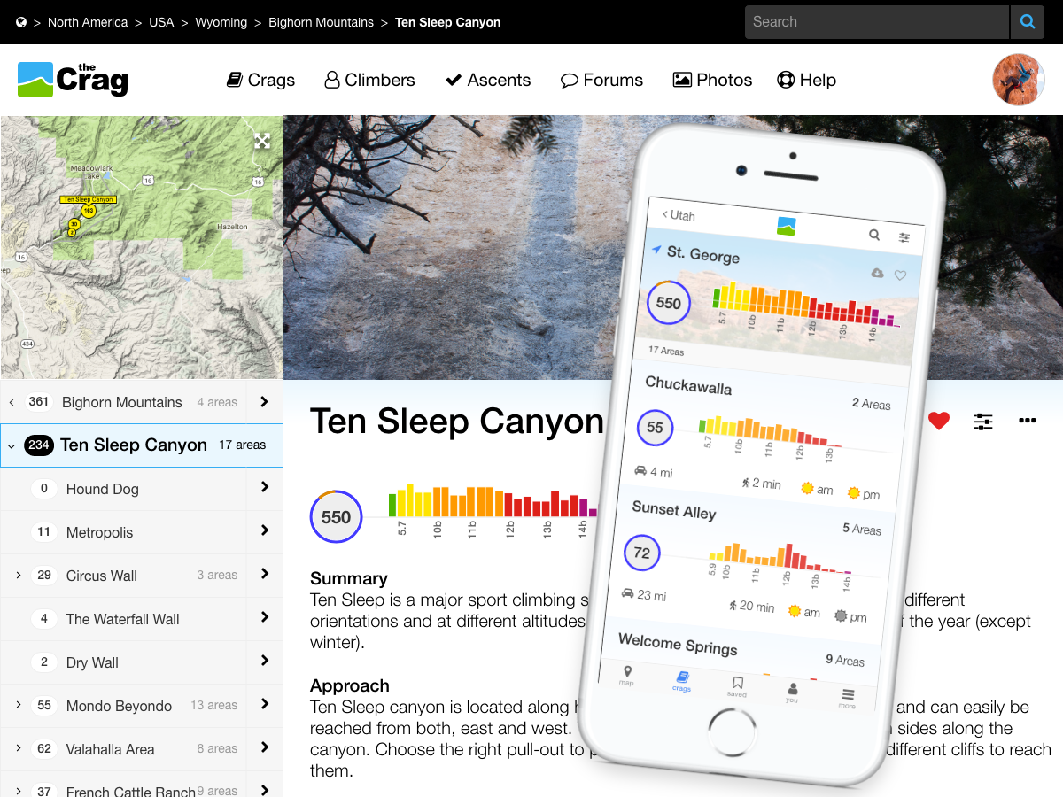
← Back