← Back
Better Hiring with an Operational Dashboard
My Role
Principal Product Designer (2016 - 2020)
Worked with PM, Engineering & Growth teams, and the Founder at Poached Jobs
Skills Used
Interaction Design, Prototyping, Visual Design, Information Architecture, Qualitative & Quantitative Research, Data, Analytics, KPIs
Summary
A customer pays poached to fill an open position (the job to be done). When an active customer visited Poached, they simply saw a list of jobs with a count of applications. I designed a dashboard to make the hiring process easier and more effective.
Discovery
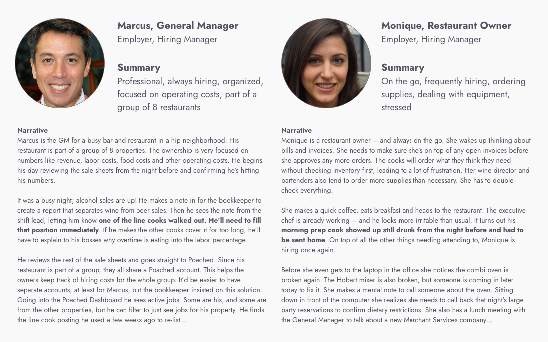
Our customers like Marcus and Monique are hiring frequently (or constantly), generally for positions that need to be filled immediately (e.g. the cook just walked out).
Hypothesis
Showing Marcus how his job posts are performing will empower him to:
- Take available actions to improve performance.
- Get more qualified applicants in less time.
- Be more satisfied as a customer.
Design
Because Marcus’s needs are slightly more complex than Monique’s, we’ll focus on him. This will be an operational dashboard, not an analytical dashboard. Our objective will be to design a dashboard that helps Marcus at every stage of the hiring process. What does Marcus want and need from a dashboard?
User Stories
- I need to be able to post a new job or repost a job I’ve posted in the past.
- I want to see my jobs for a particular location and be able to find a specific job.
- I want to see the status of my jobs and see if my active jobs are getting enough applications.
- I want to be able to promote my job if I’m not getting enough applications.
- I want to see if I have new applications, and be able to quickly access applicants I am considering for the position.
Relevance
We want to show Marcus the most relevant jobs. Marcus will be:
- Thinking about his jobs by age (“The job I posted yesterday”).
- By location (“My bartender job downtown”), because his group hires for multiple locations.
- And of course, "Which jobs have new applications?"
Recent, Not Active
A job post may have ended or been taken down before the position is filled. Marcus still needs quick access to the applicants for any recent job, active or not.
Number of Jobs
How many jobs will Marcus have on his dashboard at once? I ran a distribution of jobs by customer for a 30-day hiring window. The average number of jobs was three, and the 99th percentile was nine. I also checked analytics to find that mobile accounted for only 3% of traffic for the job list. This confirmed that a card pattern would work well here.
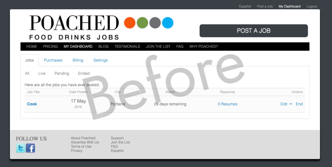
An early mockup of the dashboard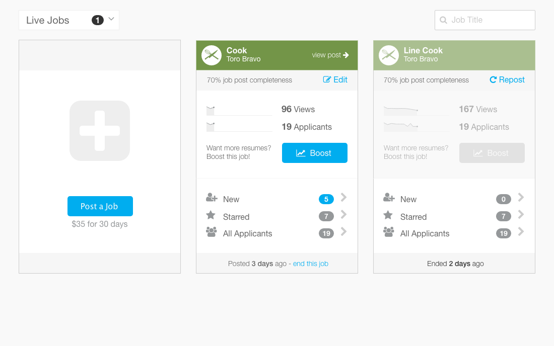
Is My Job Performing?
Marcus needs to know if he’s getting enough applications for a job. He’ll also be thinking about the quality of applicants he’s getting. If he’s not getting enough quality applications he’ll be blaming Poached. The quality of his job post helps determines whether people apply. We want Marcus to know that he’s in control and empower him to be successful.
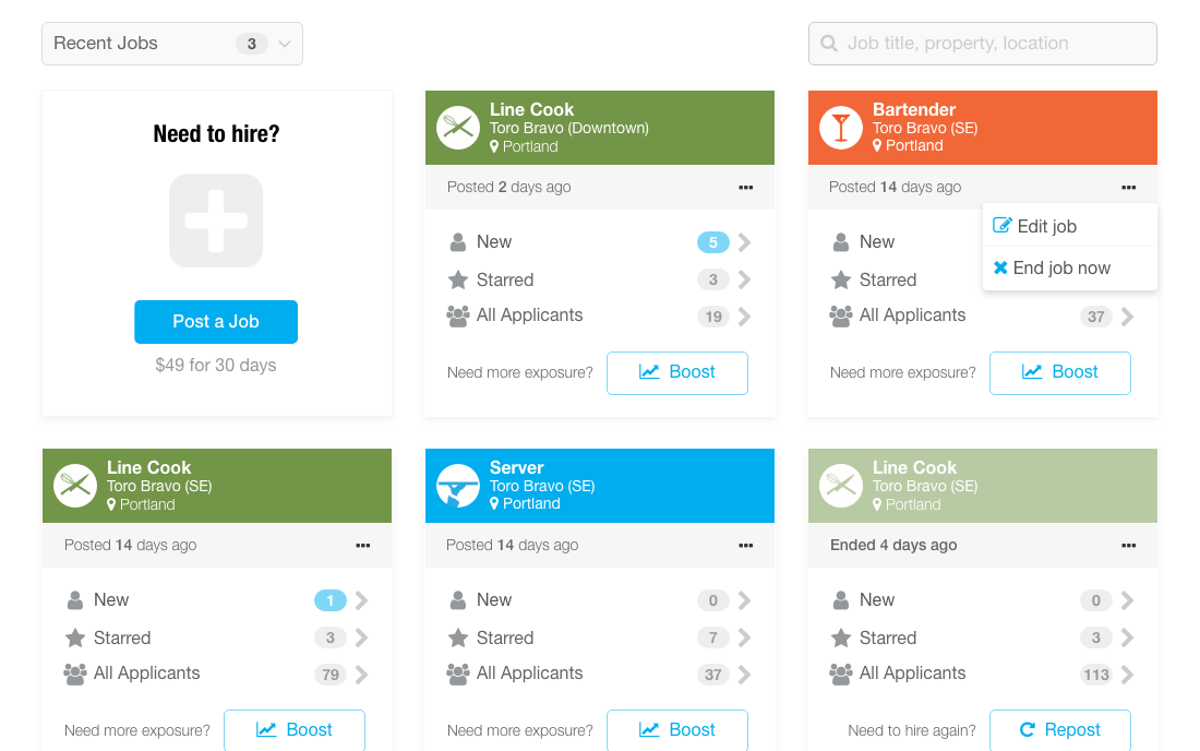
Daily Views and Applications
Job seekers want to see recent jobs. Views will trail off quickly over time. We’ll make this visual for Marcus so he can promote his job if he needs more exposure.
Quality Score
If people are viewing his job but not applying, he may need to improve the job post. We will help tell this story by directly stating the relative quality of his post.
Refining the design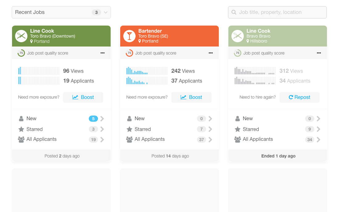
Need to Hire?
If Marcus hasn’t hired in a while or is new and has never hired with Poached we want to show him a useful empty state that will get him onboarded and hiring with Poached.
A helpful empty state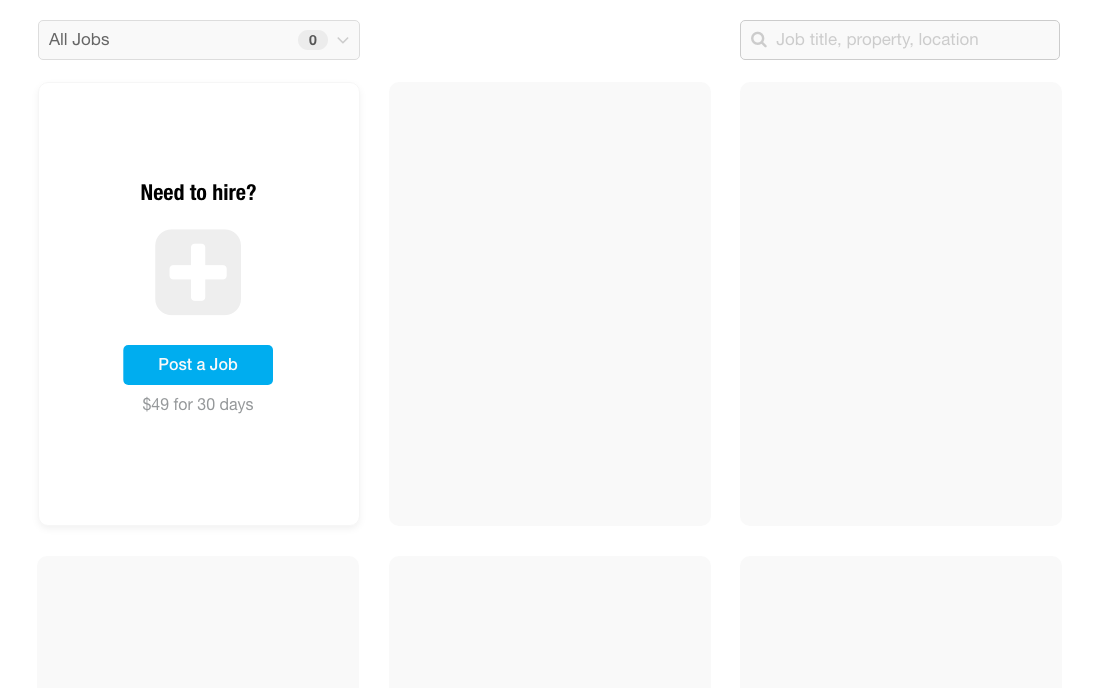
Ship Early
There are always constraints. We cut some of the best features to get something built and shipped quickly. This allowed us to learn and iterate on the design.
- The data to generate the daily graphs wasn’t available just yet. I had to modify the design to remove them.
- A quality score didn’t exist yet, and calculating one required further thought. We moved this out of scope.
Update the Design System
The card was a new pattern for our design system. To make sure we got the implementation pixel perfect, I implemented a card in HTML/CSS and provided detailed specs to engineering.
Specs for adding the card pattern to the design system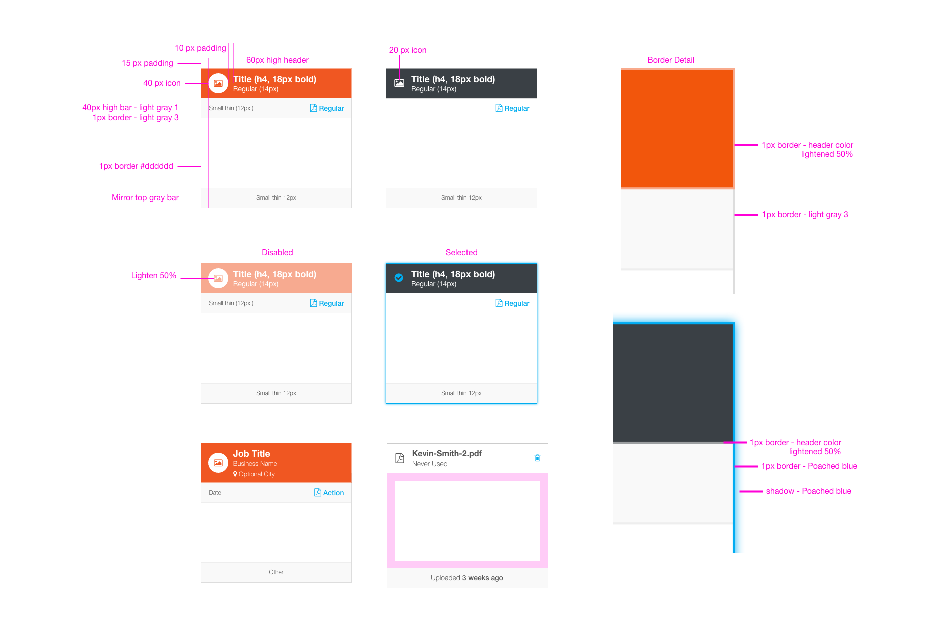
Evaluate the Outcome
- Does the customer understand how to access applications and navigate between jobs?
- Is the customer able to post new jobs and repost previous jobs?
- Does the customer understand how to edit or promote a job?
Great Results
We did a few user testing sessions, ran heatmap data to see usage, and listened for customer feedback to answer these questions. Qualitative and quantitative data all indicated that customers were being more effective with the operational aspects of the hiring process. Moreover, job promotion increased significantly (an important source of revenue for Poached). I wish I had the numbers but this was before I began recording data at Poached.
Heatmap showing usage data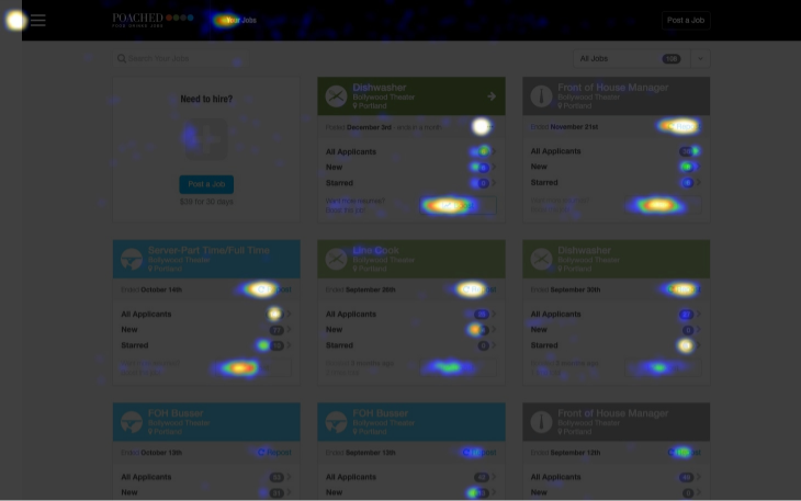
Back Story
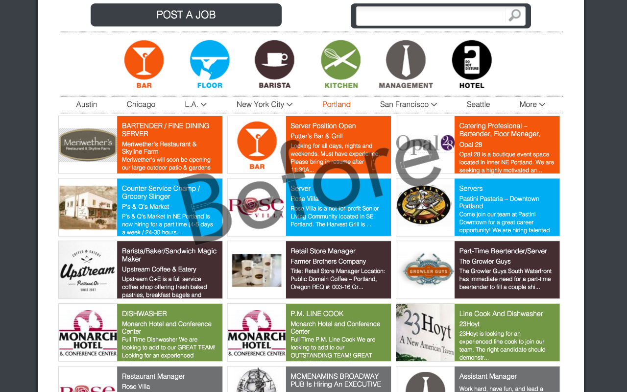
Job Tiles & Search
The job tile is at the core of the Poached brand. In a previous project, I redesigned the tiles and search experience. For consistency, I drew from the job tiles in the dashboard design. The tile redesign had come with some existing constraints.
- Jobs were classified by type and had an associated icon.
- Job tiles were colored by type and used hard square corners for impact.
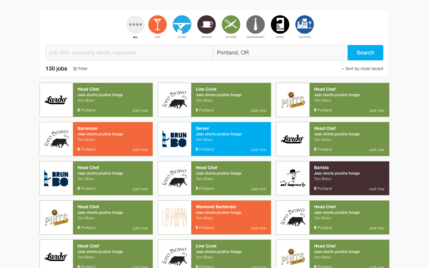
 After - Significantly improved job tiles and search experience
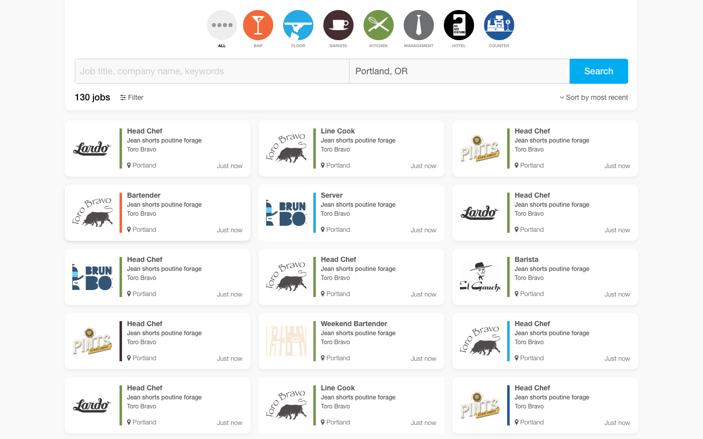
And an alternate design I recommended to improve accessibility and contrast
← Back